I'm not as knowledgeable about music as this blogger, but I enjoyed Juan Diego Flórez's concert in Dublin just as much. Yes, Florez is easy on the eye. It always helps. And we were all smitten by his charm - well at least the female half of the audience. He sings beautifully, and soulfully. The RTE concert orchestra seemed to be enjoying the evening as much as we did.
Can't wait to see him again at the Met HD's La Donna del Lago - in March next year.
Check out "Au mont Ida, Trois Déesses" in the video section or below:
Tuesday, October 28, 2014
Monday, October 27, 2014
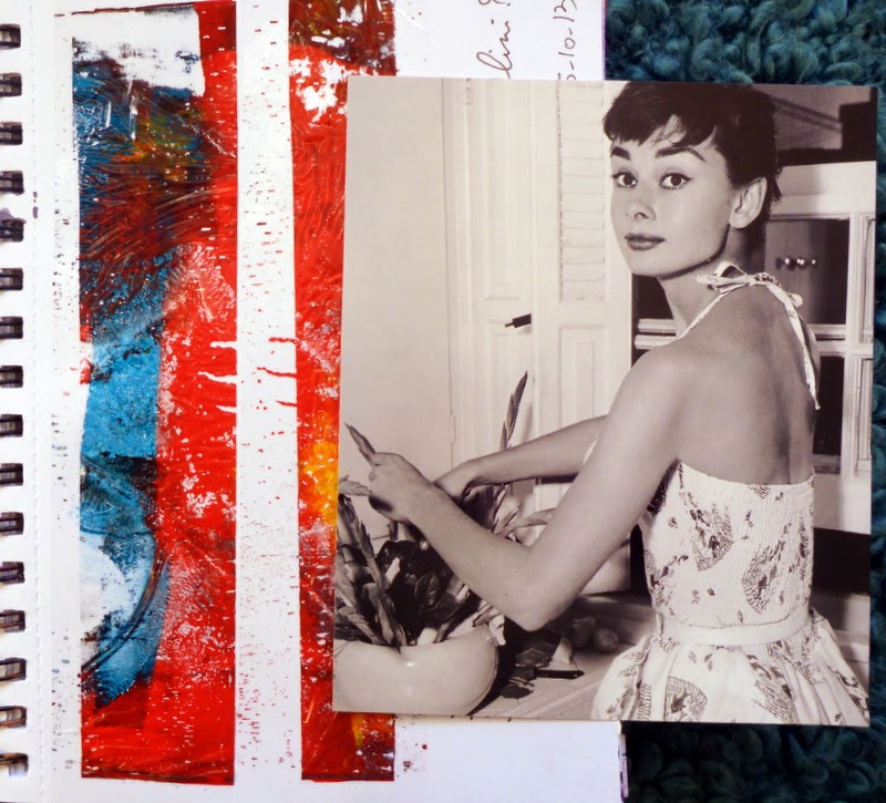
The Documented Life Project - Week 37
Week 37 challenge - Use white pen prominently
It's hard to find a good white pen. Last Christmas, I got a few as Christmas presents and I've been testing them since. My two favourites are the Uniball Signo and the Sharpie. Actually, I didn't need extensive testing to figure that out - my first sample on black paper was all I needed.
I went all over the place with this challenge.
I picked a really colourful background to start with, with the facing pages displaying warm and cool tones. A pity I can't find the gelli print in which I used those colours.
Then I selected a green and red gelli print that I thought would go well with the cooler side of the journal pages - the mistake I made was that it is never seen beside that page, being on the wrong side of the flap. Maybe I should detach the washi tape and apply it the other way round? I'll think about it when I get to journal on that page (that's not until the 1st of December). I looked for a nice drawing that would work in white - I picked a sketch I did a few years ago, of a chrysanthemum, a good flower for the season - it's the flower we put on our graves on the 1st of November.
I hadn't planned on putting anything on the reverse of the flap. But then I came across this amazing painting that will be shown by the Olivier Cornet Gallery at the Vue exhibition at the RHA this week. On his facebook page, Olivier had cropped this painting by Eoin Mac Lochlainn, "What I've seen", and I found it so striking, I had to collage it onto my page. I was further inspired by Michelle Byrne and Olivier's grand uncle, François Bost. (For information on Michelle Byrne's process, have a look at this page on her website. I love her work. Also, make sure to read Cathy Dillon's essay on the exhibition, entitled "A Terrible Beauty")
That's when I called it done!
Killiney Beach
18 degrees and amazing light - the perfect October Bank Holiday Monday!
Armed with just an iPhone. Here is a selection:


Armed with just an iPhone. Here is a selection:
Friday, October 24, 2014

Pouring and Squirting watercolours
This lady's work looks easy, but believe you me, it's not! Nita Engle's How to Make a Watercolour Paint Itself has been in my book collection for years. I've dipped in and out of it, but never really felt brave enough to experiment with the techniques she describes. Since I'm still obsessed with how to represent water in watercolour, I decided to give it another go.
After a couple of failed attempts, here is where I am:
 Failed attempt number 1: this one looks like a volcanic eruption. The big mistake I made here was to go back over my background, squirting really dark blue without spraying water over it. This was never going to look like waves.
 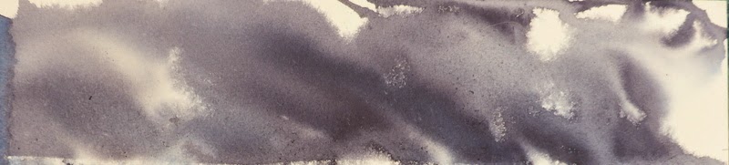 Failed Attempt number 2: I cropped all the awfulness below and only kept the dark skies.
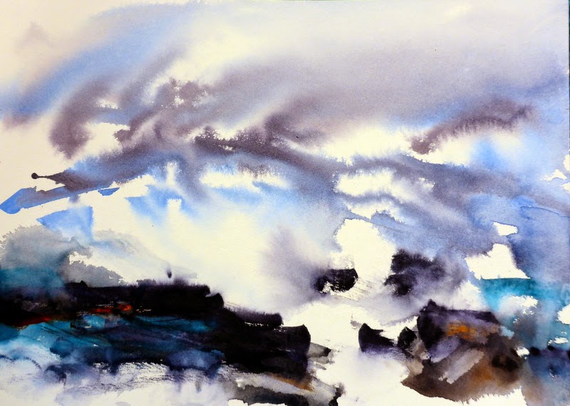 Now, this was starting to look more like what I was trying to achieve, but it still didn't look like waves. In the book, she says to tilt towards the top first to do the sky, but you will see in the video that she actually tilts to the right for the waves first, and once that has settled, she tilts to the top for the sky. I must try that next time. The rocks at the bottom are painted on fairly dry paper with a knife, then I sprayed the bottom to soften them. I'm using Daler Rowney watercolour board - Saunders Waterford Hot Pressed - don't try these pouring techniques with watercolour paper; it will buckle and warp.
 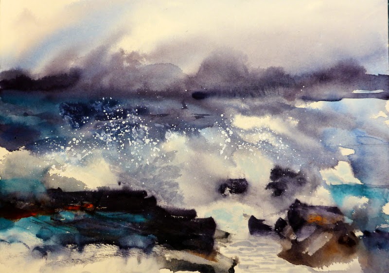 So I was happy I had a workable start. I added darker shades over my horizon and to the left. I got into difficulty when I started adding shadows in the waves. I picked too dark a colour just above the main rocks on the left, and also a permanent pigment that I can't lift. At that stage, I felt I had nothing to lose. I tried to add some spray by using white acrylic. I dabbed it first and it was disastrous. So I added some more dark watercolour to hide it. Then I flicked fairly liquid white acrylic from a brush (I masked the areas I didn't want to get hit - I just placed bits of paper over what I wanted to protect). It's messy. Don't wear good clothes. You will end up with paint on your face. But it's starting to look like a wave. I should have used gouache rather than acrylic for this, for a more matte finish, but the last tube of gouache I got ended up all dry and I had to throw it out. I'm now at a stage where I feel I have everything to lose, so I'm frozen. It's looking three-dimensional, but I'm afraid that if I add more white spray, I will lose my effect. And no book or video can help me with this. I often find, even in Ms Engel's book, that the instructions jump from a half-finished painting to a completely perfect one, without those essential steps that I need!
Thursday, October 23, 2014
Gelli Printing
I have tons of Gelli prints ready to be used for all sorts of art projects, so I'm rationing myself. But watching this lovely video puts me in the mood!

Wednesday, October 22, 2014

The Documented Life Project - Week 36
Black & White was the challenge for Week 36 - just as well I had just bought blackboard stickers!
All of this on the back of another lovely card I got for my birthday earlier this year
 And I'm quite pleased with how my date numbers turned out. But I must refine my circle stamp!
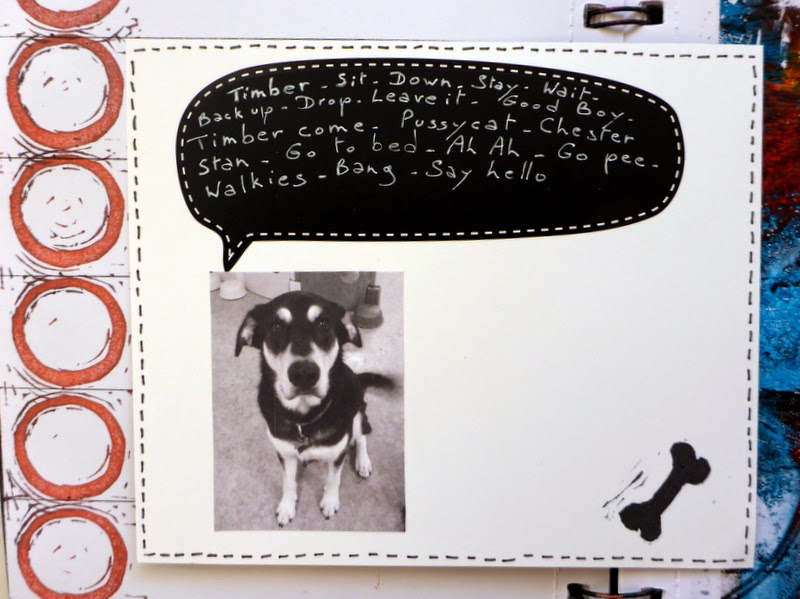
With Positive Dog Training day care, there is no shortage of cute Timber pictures! Choosing a doggy theme meant I could re-use my little bone stamp! So the proud mummy that I am decided to record the words that he knows. I've added a few to the list since I took this photo - he also knows "heel", "let's go" and "cross". I must get back to my dog-training book and find new things to teach him!
All of this on the back of another lovely card I got for my birthday earlier this year
And I'm quite pleased with how my date numbers turned out. But I must refine my circle stamp!

Tuesday, October 21, 2014
The Documented Life Project - Week 35
OK, here is the finished week 35 challenge page. I didn't use my little stamped faces after all. I'll incorporate them in another project. I kept it fairly simple, including words that came to me when I was looking at the face. And the word Paloma was just a reminder that I watched Paloma on WIGS last week! And, no, my handwriting hasn't improved - I used stickers I got in the Art & Hobby shop a while back. They're a little bit thicker than I thought, so not ideal for journaling, but they would be perfect for greeting cards


Monday, October 20, 2014


Sunday, October 19, 2014
Le Nozze di Figaro
Delightful!
Amanda Majeski's Contessa was beautiful and moving
Isabel Leonard's Cherubino was glorious!
And Marlis Petersen's Susanna was so much fun! Perfect for the role.
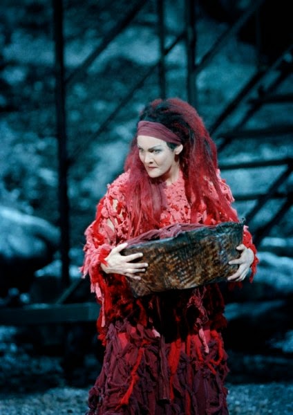 And you're all going to think I'm crazy, but I was looking at her website, and there is this photo of her in the role of Medea, and doesn't she look like Red in Orange is the New Black?
Amanda Majeski's Contessa was beautiful and moving
Isabel Leonard's Cherubino was glorious!
And Marlis Petersen's Susanna was so much fun! Perfect for the role.
Friday, October 17, 2014


Subscribe to:
Posts (Atom)